By Steve Kirsch
Steve Kirsch newsletter
December 28, 2022
Executive summary
Now, with a simple four question survey, anyone can prove for themselves the vaccines should be stopped. So if you don't believe me, collect your own data.
My data showed that, among other things, "died suddenly" wasn't an issue for those <65 who were unvaccinated in 2021 and 2022. But it was the #1 cause of death for those in that age group who were vaccinated. How will they explain that?
Have you ever wondered why isn't anyone in the mainstream media or any public health authority doing this simple survey? It's simple: it would reveal that the vaccines killed more people than COVID did. That would destroy trust in the medical community, members of Congress, the mainstream media, state and local legislators and public health officials, government health organizations (CDC, FDA, NIH,...). That's why they will not do this survey. They will never do this survey.
Note that my physician office survey is the most telling because of the professional judgments as to the cause of deaths. The advantage to this method is that people can run their own surveys and see the anomalies for themselves.
Introduction
My latest survey shows you don't need to be a math genius to figure out whether the COVID vaccines are safe or not. You just survey people and ask four questions about anyone who died in 2020 and beyond:
- Age
- Whether they were vaccinated with the COVID vaccine
- Year of death
- Causes of death
That subset of my survey is all you need.
About the graphs
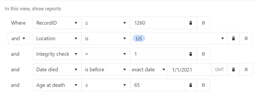
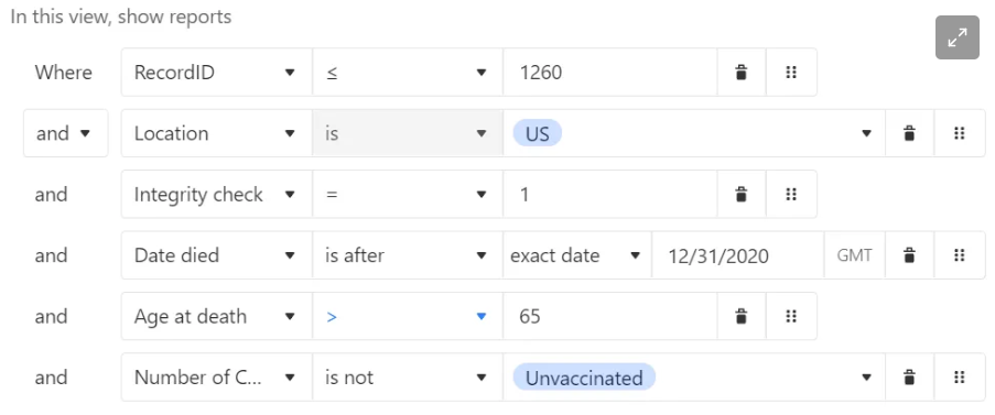
- I used a filter condition of RecordID <= 1260 AND country = USA and Integrity=1 (it passed various sanity checks). This way, my charts are repeatable if records are added to the database.
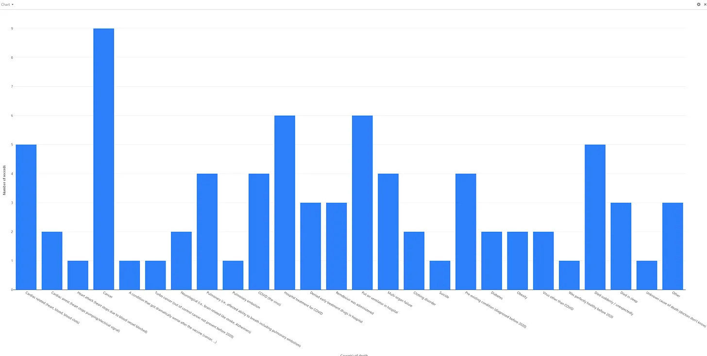
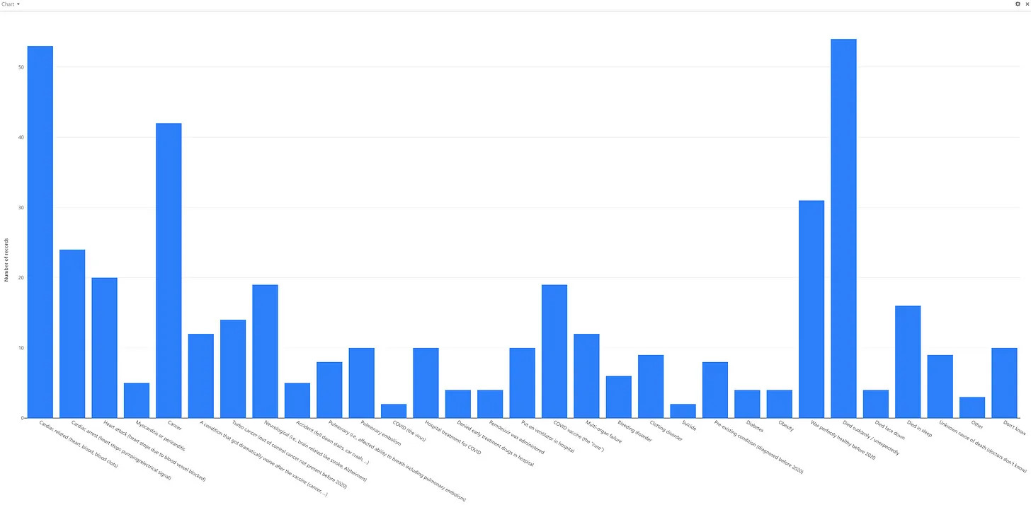
- For age ranges: <65 and 65 and older, I show three charts: 2020 causes of death, 2021/2 unvaxxed causes of death, and 2021/2 vaxxed causes of death. If the vaccine is perfectly "safe and effective" like they say, the vaxxed will have a shape that only differs from the others with a lower COVID death rate. Ignore the scale on the graphs... it's the overall "shape" of the various death causes that matters, not the absolute number of reports. For example, here's the first chart.
And here is the final chart filter condition:
Causes of death: baseline data (2020)
Note that the columns don't line up because Airtable omits them if they are zero.
Note: Click each chart below to see it full size.
Age <=65, Died in 2020
Note: Cancer is the #1 killer (nearly double the next leading cause of death), Hospital treatments for COVID is next, Cardiac related and sudden death are around equal. The COVID the virus is next. Turbo cancers, pulmonary embolism, heart attack, unknown cause of death are all low and comparable to each other. Turbo cancer is 1/9 of cancer reports. No myocarditis deaths.
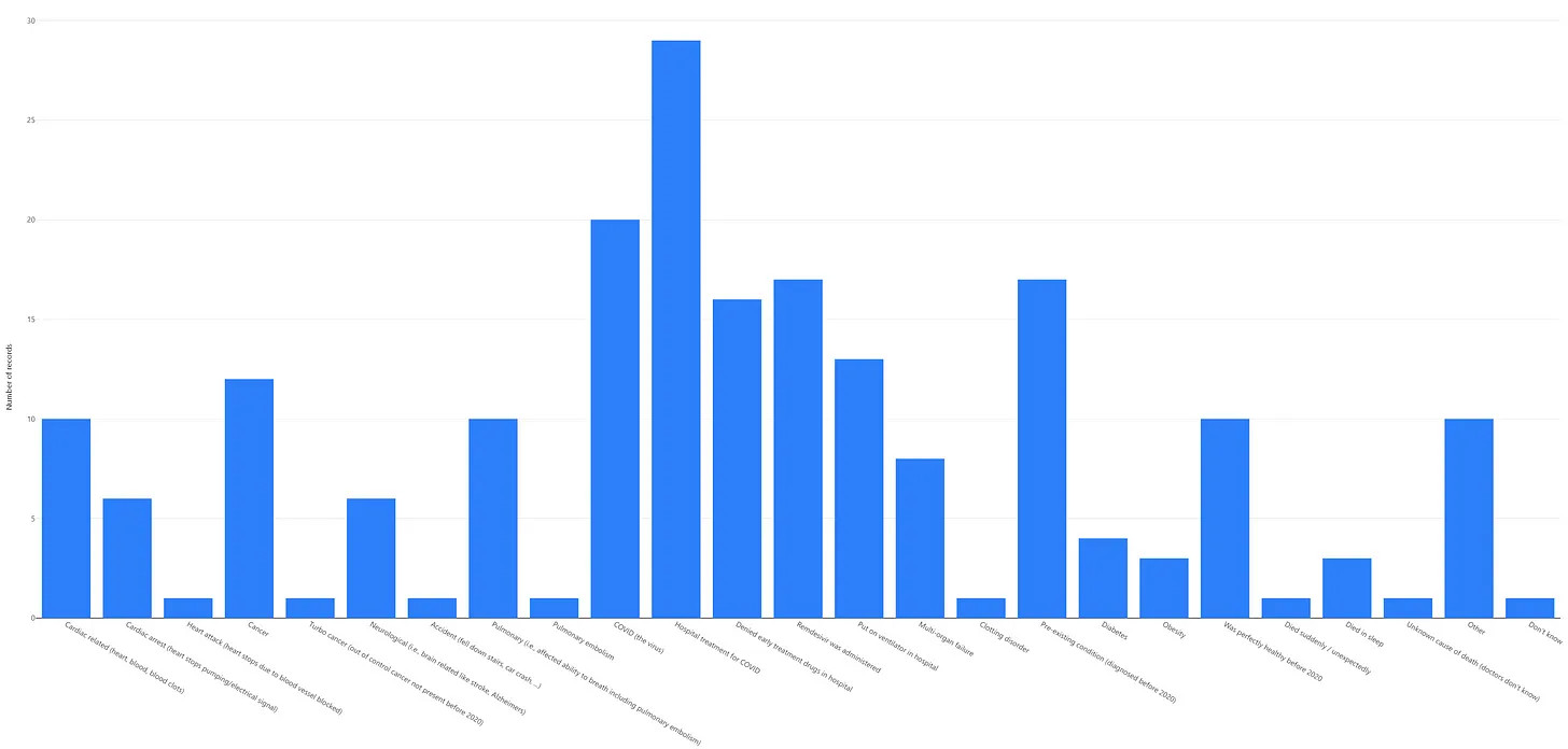
Age >65, Died in 2020
Note: Pre-existing conditions are the top cause of death. Cancer is next. COVID is next. Cardiac issues are the next. Cardiac related and sudden death are around equal. The COVID the virus is next. pulmonary embolism, heart attack, unknown cause of death are all low and comparable to each other. There are NO turbo cancer deaths!! No myocarditis deaths.
Causes of death: unvaccinated people (2021 - 2022)
Age <=65, Died > 2020
Hospital treatments for COVID are the #1 killer. People who died suddenly, pulmonary embolism, and turbo cancers are all very low. There are no unknown causes of death. No myocarditis deaths.
Age >65, Died > 2020
Hospital treatment for COVID is the #1 killer. Heart attack, turbo cancer, and died suddenly are all low. There are no myocarditis deaths.
Causes of death: vaccinated people (2021 - 2022)
Age <=65, Died > 2020
Died suddenly is now the #1 cause of death, followed closely by cardiac-related death. Stop right there. This should be a showstopper.
Cancer is next. Turbo cancer is now significant compared to what it was before. Myocarditis is now a player and is killing more than COVID.
Age >65, Died > 2020
Cancer is the #1 cause of death. Turbo cancers are huge compared to those without the vaccine. Died suddenly is significantly elevated.
Do you see the difference?
If these charts look the same to you, you should immediately apply for a job at the CDC in the vaccine safety monitoring program.
If you are a "misinformation spreader" like me, you'll see some huge differences for the vaccinated including:
- Sudden death rates are off the charts for the vaccinated cf. unvaccinated for those <65. This is stunning. It's the #1 cause of death for this age group. This is not surprising as we are seeing this every day.
- Myocarditis as a cause of death is registering now for both age ranges but only for the vaccinated. The doctors assure us it is lower in the vaccinated, but that's not what the data says, and I can't find a single cardiologist whose number of myocarditis cases went down after the vaccines rolled out.
- Cardiac issues as a cause of death in vaccinated young people (<65) are significantly elevated vs. their unvaxxed peers.
It's no wonder that nearly all the cardiologists in the UK aren't getting any more boosters.
Doing more complex analysis
I'm sure Joel Smalley and others will be able to do more sophisticated analysis (and do so on more than just the causes of death), but the graphs above show the vaccines aren't "safe and effective," not even close.
Other analyses (using other methods) should consider:
